|
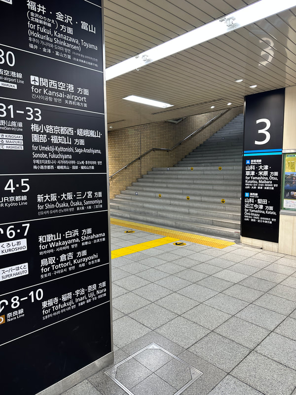
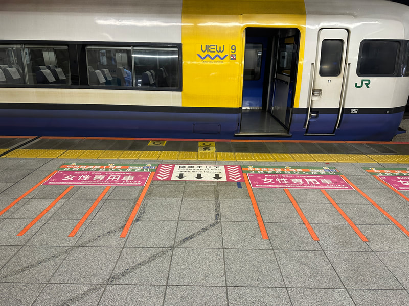
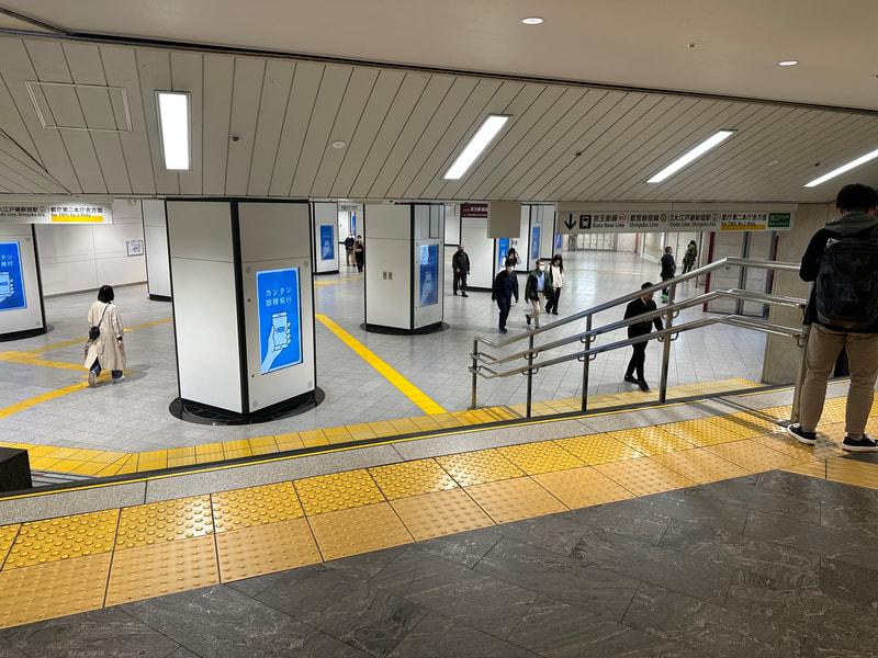
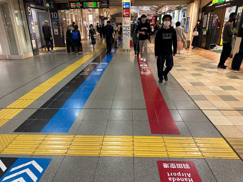
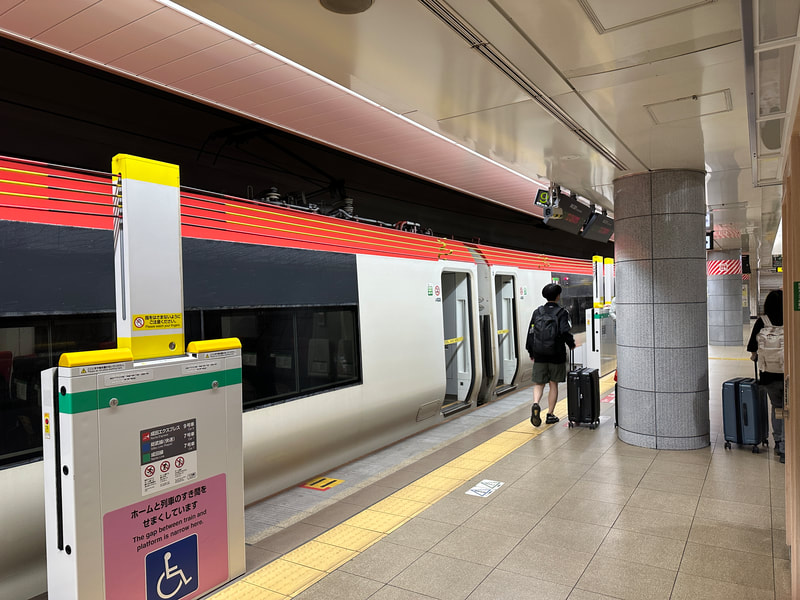
In my advocacy for the design of more visually accessible cities I am often asked who is the leader? What are the best practices and who is getting it right? While I have yet to find a city or country that has it all figured out Japan is the closest to putting together the pieces. Last month I had the fortune to visit this bustling and culturally rich country, visiting several cities that offered a good sampling of how they approach accessible design and in particular visual accessibility. For context Japan is a very populous country of roughly 126 million people confined on a series of connected islands. Combined, that substantial population and limited land are two factors that typically set the foundation for more accessible cities. The country is fundamentally built around public transportation having opted nationally to avoid mobility oriented around cars and planes in the early 1960s. Add in two other key factors unique to Japan, an older demographic and a culture based on respect and the advanced practice I saw is further appreciated. In terms of demographics Japan’s largest population cohort is amongst seniors around 75 years in age meaning they have a large portion of the population needing assistance with mobility beyond those who may have a non-age related mobility restriction. The next population bulge at 55 years will soon add to age related mobility limitations. Surrounding all of this is Japanese culture which emphasizes respect and honouring others. This means accommodating others is part of the culture as is respect for the public realm. The result: crime, vandalism and litter are rare. Thus the public realm always appears clean, orderly and well maintained even before any specific accessible design features. It is not perfect of course as changes to infrastructure and cultural mindsets about disabilities takes time. The big push toward more accessibility started in 2006 when Japan passed the Barrier Free Act requiring public then private entities to improve access. This effort with later propelled by the 2020 Tokyo Olympic games with the adoption of the Universal Design 2020 Action Plan in early 2017. Now in terms of what specifically makes Japan a unique leader. Accessible design is comprehensive and consistent. Over the course of several days I observed a very comprehensive application of accessible design features around Tokyo. First I thought it was just Tokyo that had it figured out. Then I visited Kanazawa, Takayama, Hiroshima and Kyoto only to pleasantly find that they too applied the same practices on an equally comprehensive basis. From tactile walking surface indicators to frequent and easy to read signage, the form and application was continuous and thorough. Attention and guidance walking surface indicators are evident both indoors and out using a consistent yellow or dark grey colour and are contiguous even when crossing streets. In some instances the amount of yellow on the ground from walking surface indicators was a bit overwhelming so there are some aesthetic choices and challenges to be considered. My sense however is that these also provide navigation guidance for the fully sighted as they make paths of travel clear and thus avoid congestion. Signage consistently used large font, contrasting colours and was more often located at eye level. This is also true for digital terminals such as ticketing machines, bank machines and electronic information boards. Moving from one facility such as a public train station to a private shopping centre didn’t result in forms, colours and styles changing drastically. This reflects Japan having set some common design standards for both public and private facilities. All the senses and surfaces are engaged.
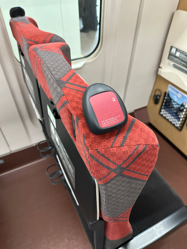
Information is also provided in tactile form through the use of Braille. Note that this is Japanese braille so may not be familiar to visitors. Hand rails are also standard wherever elevation changes allowing for increased stability for movement. All surfaces including floors and walls are also put to work. Arrows on the ground communicate everything from directions of travel for crowd management to directions toward popular destinations. Full painted lines are also common allowing a person to follow it all the way to their destination. Mobility is a way of life, that means wayfinding and data. In a country that is densely populated and oriented around public transportation getting around quickly and easily is critical. Detailed information has been integrated into apps like Google Maps and Waze easing movement through complex transportation systems guiding you to the right levels, platforms and even best train carriages based on connections and capacity. At the same time real-time information on departures and arrivals at train stations and bus terminals is in large font and high contrasting colours. Audible announcements on destinations and stops can also be heard at nearly every station or on-board vehicles. Announcements are provided in Japanese and English. Combine these elements with frequent, larger and well-designed wayfinding maps and the complexity of Japan’s large cities becomes significantly more manageable.
1 Comment
5/13/2023 10:27:31 am
Really enjoyed this post and the illustrative photos. I’m fully sighted, but in my own travels to Japan I also appreciated all the design elements Japan has used to make places and the ways to get there accessible for everyone. I thought your comment on the cultural influence was astute. What would Canada look like if we structured it in a way that demonstrated respect for everyone who lives and visits here? Thanks for the informative post!
Reply
Leave a Reply. |
Devin CausleyTrained in town planning, an avid traveler and legally blind myself I write on issues and opportunities is see along my travels that could improve our cities from a visual perspective. Archives
January 2024
Categories |
|
|
Visually Accessible Cities is the creation of Devin Causley, a town planner by training who has also lived with low vision since birth. This unique combination along with insights from extensive travels around the world provide perspective on how cities can be built better to engage those of us with limited or no sight. Cities that are more visually accessible will ultimately be more livable for everyone.
|

 RSS Feed